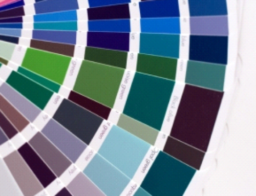
I have seen many changes in trends since i began painting in 1995; one of which seems to be very current; probably since about 2018. Gray is dominating in almost all spaces, whether it is dark as charcoal or as light as a cloudy sky. Heck, I even painted my own interior with a color named Metropolitan which at the time was Sherwin Williams #1 color for 2019. The thing that I love about trends is some last longer than others; so maybe all of my other trends in flooring, tiling, and light fixtures could hold up awhile. Trends tend to only last about a decade.
I turned today to a brief article online as I always do to see what others are saying about colors this year in Spring of 2020 and much to my suprise Gray seems to be fading. People are choosing more about moods than the colors themselves. Interesting. The year i began as a professional white was still all the rave, how boring is that ? But, considering that painters and white seems to always be a trend i assumed that’s part of what made the color white so popular. Well folks, white is trending again in 2020. Imagine the suprise, when i found out. It didn’t take long for White to become more of what alot of my customers in those days use to say ” Dirty White “; then of course came the vanilla colors, then the Beige’s, and sometimes even Gold. Let me start by saying whatever the trends may be, pick a color that will enhance a mood for you. I had a wonderful customer once ask for a truly bright yellow for the kitchen. She knew each morning it would remind her of the Sun and start her day in a very bright way. I loved the idea.
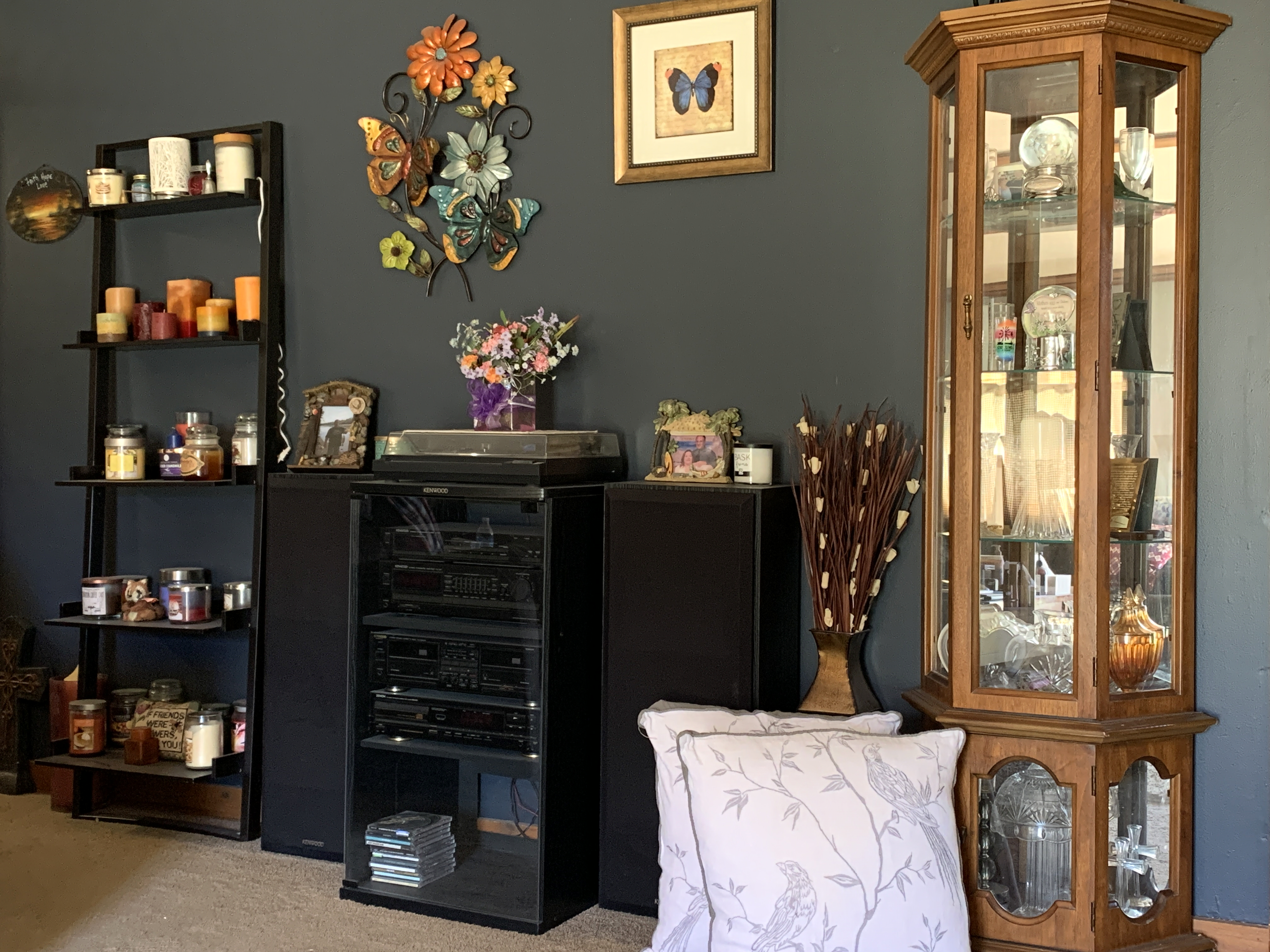
This story is more about what you want in life, more than anything i could ever advise, point you too, or even suggest. Although, over time I must admit; my moods have changed as i get older and then I am ready for another color in my life. The photo i am sharing with you above shows exactly my point. Over the winter my wife and I decided to change the color of a support wall we like to refer to as our accent wall. For many years in our home it was a fall color very much like a burnt orange. I had used the color to enhance the natural wood and I thought it was great. Let me say, the current blue is so rich,warm, and cozy; it’s hard to not want to be in the room. I would have to say as a professional painter, I had never truly looked at color with such an excitement as I have recently. It is my hope that when you choose your colors, whether in 2020 or for many years to come we can all become our own Trendsetters.


